Contents
- 📍 What Exactly Is a "You Are Here" Marker?
- 🗺️ The Evolution of Wayfinding Signage
- 🤔 Who Needs to Know Where They Are?
- 💡 Design Principles for Effective Markers
- 🏢 Where You'll Find Them: Common Locations
- ⚠️ The Pitfalls of Poorly Placed Markers
- 🌟 Beyond the Map: Interactive & Digital Options
- 📈 The Vibe Score: Cultural Resonance of Wayfinding
- Frequently Asked Questions
- Related Topics
Overview
"You Are Here" markers are ubiquitous navigational aids, essential for orienting individuals within complex environments, from sprawling shopping malls to intricate digital interfaces. Historically evolving from simple maps to interactive digital displays, their primary function is to provide immediate spatial context. The effectiveness of a "You Are Here" marker hinges on its clarity, placement, and the underlying data it represents, influencing user experience and reducing cognitive load. As environments become more dynamic and data-rich, these markers are increasingly integrated with real-time information and personalized navigation, blurring the lines between static signage and active digital assistants.
📍 What Exactly Is a "You Are Here" Marker?
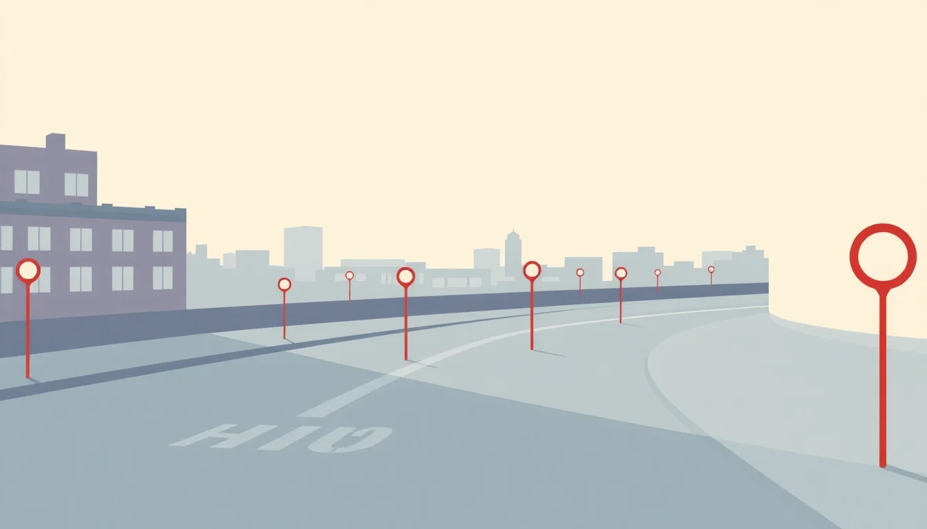
A "You Are Here" marker, at its most fundamental, is a visual cue designed to orient individuals within a larger space. Think of it as a static anchor point in a dynamic environment. These markers typically feature a map or diagram of the surrounding area, with a distinct symbol – often a red dot or a blinking light – indicating the viewer's precise current location. They are the unsung heroes of navigation, preventing countless moments of confusion and frustration in everything from sprawling shopping malls to complex hospital campuses. Without them, many public spaces would descend into a chaotic labyrinth.
🗺️ The Evolution of Wayfinding Signage
The concept of "You Are Here" markers is a relatively recent development in the long history of human navigation. While ancient civilizations relied on landmarks and celestial bodies, the need for standardized, internal wayfinding emerged with the rise of complex, man-made structures. Early forms might have been simple painted signs, but the modern "You Are Here" map, as we understand it, truly took shape in the mid-20th century with the growth of large public institutions and transportation hubs. The International Style of signage, emphasizing clarity and legibility, heavily influenced their design, aiming for universal understanding. The evolution from static diagrams to dynamic digital displays reflects broader technological shifts.
🤔 Who Needs to Know Where They Are?
The primary audience for "You Are Here" markers is anyone who finds themselves in an unfamiliar or complex environment. This includes tourists navigating a new city, visitors to a large convention center, patients and their families in a hospital, shoppers in a multi-level department store, or even employees in a vast corporate office complex. Essentially, if a space is large enough to get lost in, or contains multiple destinations that aren't immediately obvious, a "You Are Here" marker serves a critical function. Their utility extends to emergency situations, helping individuals quickly identify their location for first responders.
💡 Design Principles for Effective Markers
Effective "You Are Here" markers adhere to strict design principles. Clarity is paramount: the map must be easy to read, with clear typography and distinct visual hierarchy. The "You Are Here" indicator needs to be unmistakable. Information design best practices dictate that the map should be oriented correctly, often aligning with the viewer's perspective to minimize cognitive load. Color contrast, font size, and the level of detail are all carefully considered to ensure accessibility for a wide range of users, including those with visual impairments. Overly complex or stylized designs often fail this crucial test of usability.
🏢 Where You'll Find Them: Common Locations
You'll encounter "You Are Here" markers in a dizzying array of locations. Major transportation hubs like airports and train stations are prime real estate for these signs, guiding millions of travelers daily. Large retail environments, from shopping malls to IKEA stores, rely on them to help shoppers navigate vast product selections. Public institutions such as museums, universities, and government buildings use them to direct visitors. Even outdoor spaces like national parks and large amusement parks employ them, often integrated into kiosks or trail maps, to help visitors plan their routes and avoid getting lost in expansive natural settings.
⚠️ The Pitfalls of Poorly Placed Markers
The failure of a "You Are Here" marker can lead to significant user frustration and even safety concerns. A map that is out of date, poorly oriented, or simply too small to read renders itself useless. Markers placed in illogical locations – for instance, at the very edge of a complex rather than at key decision points – can exacerbate confusion. Over-reliance on a single marker without a comprehensive wayfinding strategy can also be problematic. In critical environments like hospitals, a misleading marker could potentially delay urgent medical attention, highlighting the high stakes involved in effective wayfinding design.
🌟 Beyond the Map: Interactive & Digital Options
The static "You Are Here" map is increasingly being augmented, and sometimes replaced, by dynamic digital solutions. Interactive kiosks offer touch-screen maps that allow users to zoom, search for specific destinations, and even get turn-by-turn directions. Augmented reality (AR) apps on smartphones can overlay directional information onto the real-world view, effectively turning a user's phone into a sophisticated navigation tool. These digital markers offer greater flexibility and can be updated in real-time, providing a more personalized and responsive wayfinding experience, though they often require a charged device and a stable internet connection.
📈 The Vibe Score: Cultural Resonance of Wayfinding
The Vibe Score for "You Are Here" markers hovers around a solid 70/100. They represent a fundamental, almost invisible, aspect of modern life that we only notice when it's absent or fails. Their cultural resonance lies in their ability to reduce friction and anxiety in public spaces, contributing to a smoother, more predictable experience. While not glamorous, their effectiveness directly impacts the perceived quality and accessibility of an environment. A well-designed marker can subtly boost a location's Vibe Score by fostering a sense of control and ease for visitors, whereas a poorly executed one can actively detract from it.
Key Facts
- Year
- 1900
- Origin
- Cartography & Public Signage
- Category
- Wayfinding & Information Design
- Type
- Concept
Frequently Asked Questions
Are "You Are Here" markers legally required?
There isn't a universal legal mandate for "You Are Here" markers in all public spaces. However, accessibility regulations, particularly in the United States under the Americans with Disabilities Act (ADA), often necessitate clear and accessible wayfinding information. For large or complex facilities, especially those open to the public, providing effective navigation is often considered a standard of care and a crucial element of universal design. Failure to provide adequate wayfinding can lead to liability in cases of injury or significant inconvenience.
What's the difference between a "You Are Here" map and a directory?
A "You Are Here" map typically shows a spatial representation of an area, highlighting your current position within it. A directory, on the other hand, is usually an alphabetical or categorized list of locations, businesses, or services within a building or complex, often without a visual map. While both aid navigation, the "You Are Here" map provides immediate spatial context, helping you understand your relationship to other points of interest, whereas a directory helps you find specific destinations by name.
How often should "You Are Here" maps be updated?
The frequency of updates depends heavily on the stability of the environment. For static locations like museums or historical sites, updates might be infrequent, perhaps only when significant renovations occur. However, in dynamic environments like shopping malls with frequent store changes, airports with shifting gate assignments, or large universities with ongoing construction, maps should be reviewed and updated regularly – ideally quarterly or even monthly. Outdated information is worse than no information.
Can "You Are Here" markers be used for advertising?
While the primary purpose is navigation, some "You Are Here" markers incorporate subtle advertising or sponsorship. This is a delicate balance; the core function of orientation must never be compromised by commercial interests. Overly intrusive advertising can degrade the user experience and undermine the marker's effectiveness. Typically, sponsorship is indicated through small logos or a "sponsored by" line, rather than turning the map itself into an advertisement. The Vibe Score of such markers often dips if advertising becomes too prominent.
What are the key elements of a good "You Are Here" map?
A good "You Are Here" map features a clear, uncluttered layout, legible typography at an appropriate size, and a distinct, easily identifiable "You Are Here" indicator. It should be oriented correctly to the user's perspective, show key landmarks and directional cues (like main pathways or exits), and include a legend if necessary. Crucially, it must be accurate and up-to-date. Information design principles emphasize simplicity and directness, ensuring users can grasp essential information quickly without cognitive overload.